Visualization
There are a large number of tools that can be used to read in Castro or AMReX data and make plots. These tools all work from Castro plotfiles. Here we give an overview of the variables in plotfiles and controlling their output, as well as some of the tools that can be used for visualization.
Visualization Tools
amrvis
Our favorite visualization tool is amrvis. We heartily encourage you to build the amrvis2d and amrvis3d executables, and to try using them to visualize your data. A very useful feature is View/Dataset, which allows you to actually view the numbers – this can be handy for debugging. You can modify how many levels of data you want to see, whether you want to see the grid boxes or not, what palette you use, etc.
If you like to have amrvis display a certain variable, at a certain scale, when you first bring up each plotfile (you can always change it once the amrvis window is open), you can modify the amrvis.defaults file in your directory to have amrvis default to these settings every time you run it. The directories CoreCollapse, HSE_test, Sod and Sedov have amrvis.defaults files in them. If you are working in a new run directory, simply copy one of these and modify it.
VisIt
VisIt is also a great visualization tool, and it directly handles our
plotfile format (which it calls Boxlib). For more information check
out visit.llnl.gov.
[Useful tip:] To use the Boxlib3D plugin, select it from File
\(\rightarrow\) Open file \(\rightarrow\) Open file as type Boxlib, and
then the key is to read the Header file, plt00000/Header, for example,
rather than telling it to read plt00000.
yt
yt is a free and open-source software that provides data analysis and publication-level visualization tools for astrophysical simulation results such as those Castro produces. As yt is script-based, it’s not as easy to use as VisIt, and certainly not as easy as amrvis, but the images can be worth it! Here we do not flesh out yt, but give an overview intended to get a person started. Full documentation and explanations from which this section was adapted can be found at http://yt-project.org/doc/index.html.
Example notebook
Using the plotfiles generated in the example in the Getting Started section, here we demonstrate how to use yt to load and visualize data. This section was generated from a Jupyter notebook which can be found in Docs/source/yt_example.ipynb in the Castro repo.
import yt
import matplotlib.pyplot as plt
import numpy as np

# set matplotlib formatting to be the same as yt
plt.rcParams['font.size'] = 14
plt.rcParams['font.family'] = 'serif'
plt.rcParams['mathtext.fontset'] = 'stix'
# load data from file
ds = yt.load('../../Exec/hydro_tests/Sedov/sedov_2d_cyl_in_cart_plt00150/', hint="castro")
yt : [INFO     ] 2020-05-29 16:40:16,890 Parameters: current_time              = 0.1
yt : [INFO     ] 2020-05-29 16:40:16,891 Parameters: domain_dimensions         = [32 32  1]
yt : [INFO     ] 2020-05-29 16:40:16,891 Parameters: domain_left_edge          = [0. 0. 0.]
yt : [INFO     ] 2020-05-29 16:40:16,892 Parameters: domain_right_edge         = [1. 1. 1.]
# print out fields available for plotting
print([f for _,f in ds.field_list])
['Gamma_1', 'MachNumber', 'StateErr_0', 'StateErr_1', 'StateErr_2', 'Temp', 'X(X)', 'abar', 'angular_momentum_x', 'angular_momentum_y', 'angular_momentum_z', 'circvel', 'density', 'divu', 'eint_E', 'eint_e', 'entropy', 'kineng', 'logden', 'magmom', 'magvel', 'magvort', 'pressure', 'radvel', 'rho_E', 'rho_X', 'rho_e', 'soundspeed', 'x_velocity', 'xmom', 'y_velocity', 'ymom', 'z_velocity', 'zmom']
# plot the density
fig = yt.SlicePlot(ds, 'z', 'density')

# save plot to file
fig.save('sedov_density.png')

fig
yt : [INFO     ] 2020-05-29 16:40:17,234 xlim = 0.000000 1.000000
yt : [INFO     ] 2020-05-29 16:40:17,235 ylim = 0.000000 1.000000
yt : [INFO     ] 2020-05-29 16:40:17,235 xlim = 0.000000 1.000000
yt : [INFO     ] 2020-05-29 16:40:17,236 ylim = 0.000000 1.000000
yt : [INFO     ] 2020-05-29 16:40:17,237 Making a fixed resolution buffer of (('gas', 'density')) 800 by 800
yt : [INFO     ] 2020-05-29 16:40:17,392 Saving plot sedov_density.png

# plot the temperature and annotate the grids
fig = yt.SlicePlot(ds, 'z', 'Temp')
fig.annotate_grids(linewidth=2, alpha=1, edgecolors='red')
fig.annotate_cell_edges(line_width=0.0005, alpha=0.4, color='white')
fig
yt : [INFO     ] 2020-05-29 16:40:17,748 xlim = 0.000000 1.000000
yt : [INFO     ] 2020-05-29 16:40:17,749 ylim = 0.000000 1.000000
yt : [INFO     ] 2020-05-29 16:40:17,750 xlim = 0.000000 1.000000
yt : [INFO     ] 2020-05-29 16:40:17,750 ylim = 0.000000 1.000000
yt : [INFO     ] 2020-05-29 16:40:17,751 Making a fixed resolution buffer of (('boxlib', 'Temp')) 800 by 800
yt : [WARNING  ] 2020-05-29 16:40:17,897 Supplied id_loc but draw_ids is False. Not drawing grid ids
yt : [WARNING  ] 2020-05-29 16:40:17,899 Supplied id_loc but draw_ids is False. Not drawing grid ids
yt : [WARNING  ] 2020-05-29 16:40:17,901 Supplied id_loc but draw_ids is False. Not drawing grid ids
yt : [WARNING  ] 2020-05-29 16:40:17,903 Supplied id_loc but draw_ids is False. Not drawing grid ids
yt : [WARNING  ] 2020-05-29 16:40:17,905 Supplied id_loc but draw_ids is False. Not drawing grid ids
yt : [WARNING  ] 2020-05-29 16:40:17,906 Supplied id_loc but draw_ids is False. Not drawing grid ids
yt : [WARNING  ] 2020-05-29 16:40:17,908 Supplied id_loc but draw_ids is False. Not drawing grid ids
yt : [WARNING  ] 2020-05-29 16:40:17,910 Supplied id_loc but draw_ids is False. Not drawing grid ids
yt : [WARNING  ] 2020-05-29 16:40:17,911 Supplied id_loc but draw_ids is False. Not drawing grid ids

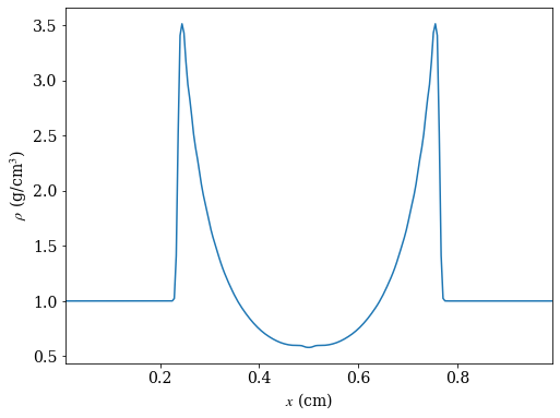
# create a line plot of the density parallel to the x-axis that cuts through the
# point of maximum density

_, c = ds.find_max("density") # find the location of the point of maximum density
ax = 0 # take cut parallel to x-axis

# use ortho_ray to cut through c
ray = ds.ortho_ray(ax, (c[1], c[2]))

# sort values by x so there are no discontinuities in the line plot
srt = np.argsort(ray['x'])

fig, ax = plt.subplots(figsize=(8,6))
ax.plot(ray['x'][srt], ray['density'][srt])
ax.set_xlabel(r'$x$ (cm)')
ax.set_ylabel(r'$\rho$ (g/cm$^3$)')
ax.set_xlim([ray['x'][srt][0], ray['x'][srt][-1]])

fig.savefig('dens_plot.png')
yt : [INFO ] 2020-05-29 16:40:18,254 Max Value is 3.51160e+00 at 0.7558593750000000 0.7558593750000000 0.5000000000000000